back to projects
Digitizatizing school exams
Advanced Product Design course, Shenkar, 2024
Overview
The brief
The brief required selecting an organization from healthcare, education/culture/tourism, or government sectors. The task was to identify an area in need of improvement or lacking digital transformation. The objective is to define the problem and opportunity, and then create a digital solution.
The challenge
I chose the field of education. The challenge was to identify an area within this sector that demands improvement or is yet to undergo digital transformation.
The process
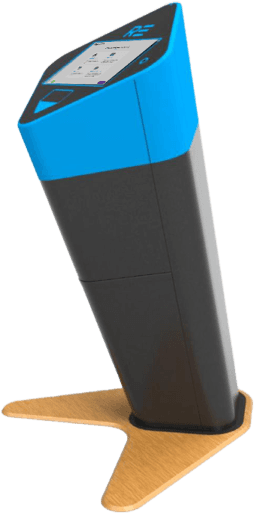
As the Quality Assurance (QA) since the end of 2018, I had the opportunity to closely monitor user feedback and complaints related to the previous generation of kiosks. This experience provided me with valuable insights into the areas that needed improvement and helped shape the development of the new generation kiosk.
The design
To address the identified needs and enhance the user experience, the following solutions were implemented:
Touch-Oriented Screen: The interface was designed to be fully touch-responsive, catering to the modern user's expectations for quick and intuitive interaction.
Progressive Layout: The layout was split into two sections, with one dedicated to providing a clear indication of progress. This new feature helps users understand their position in the process and manage their expectations.
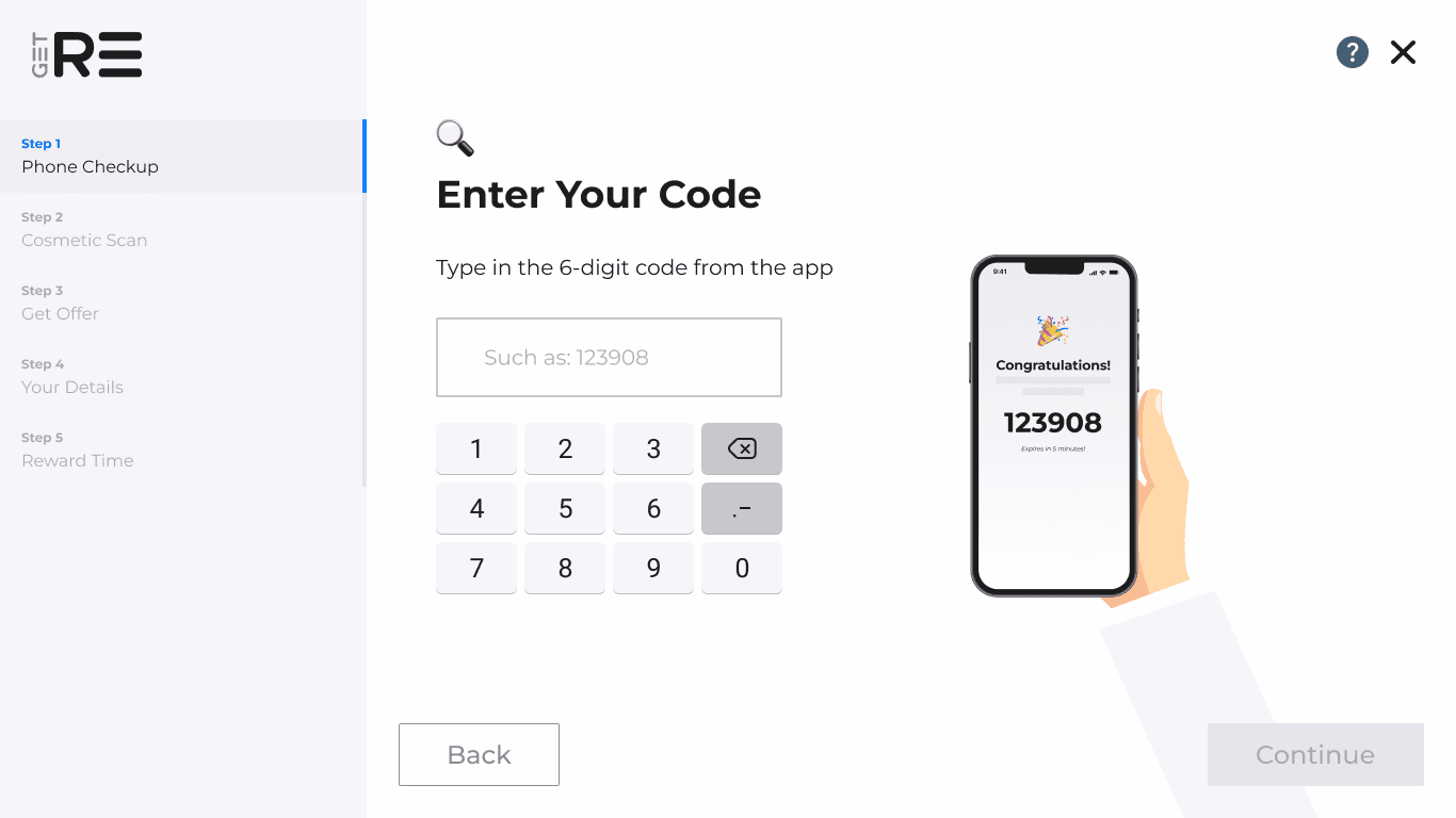
Animated Explanations: A combination of detailed explanations and animations was used to convey information in a visually appealing and easily digestible format. To keep users engaged while the system processes the price offer, a comprehensive animation was created that encapsulates the various background activities. This provides a visually appealing way to communicate the complexity of the process without overwhelming the user.
Simplified User Input: The reliance on complex user inputs was minimized, with technology taking the lead in providing necessary information. This streamlined approach ensures a smoother user experience and reduces the potential for errors.


Modular Design: The screens were designed in a Lego-style, allowing for easy customization and adaptation to meet the specific branding and functional requirements of different customers. This approach minimizes development time while maintaining a cohesive look and feel.
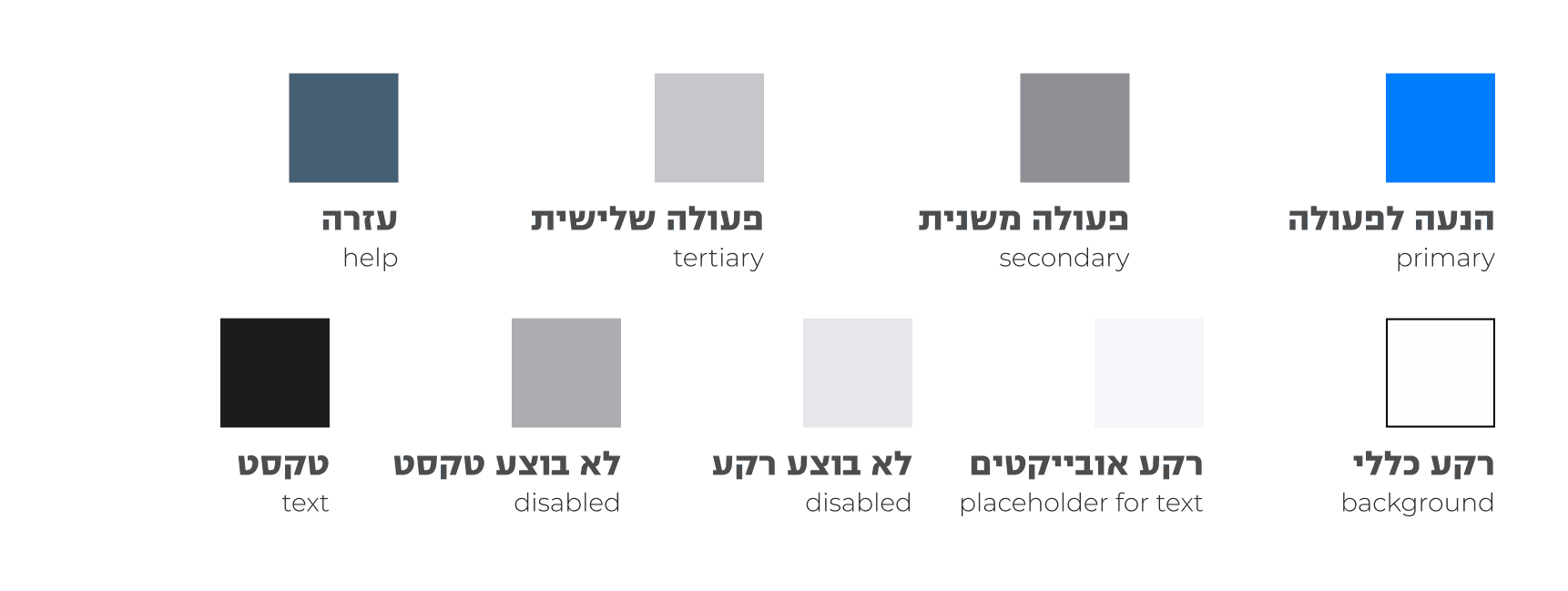
Color Palette
Typography