back to projects
UI Kit
Figma community
Overview
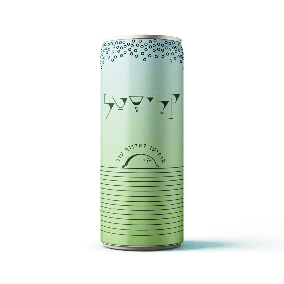
This project offers a Figma design file for the community, designed for creators looking to craft special interfaces with neumorphic buttons that shine in both dark and light modes. The file is user-friendly and packed with flexible components for easy building.
Challenge
Boho Chique Fashion, a brand synonymous with free-spirited and eclectic fashion, faced a plateau in their online sales. While their clothing line was adored, their digital platform didn't quite capture the brand's unique essence. The challenge was to translate their bohemian charm into a digital experience that resonated with their target audience.
My Role
As the lead digital designer for Boho Chique Fashion, my vision was to infuse the brand's distinct style into every facet of their online presence. Collaborating closely with their creative team, I introduced interactive lookbooks, immersive product displays, and a streamlined checkout process. The design aimed to create a virtual shopping journey that mirrored the tactile and visual delight of browsing in a Boho Chique boutique. Ensuring that the platform was not only functional but also a true reflection of the brand's ethos was paramount.
Final Thoughts
The partnership with Boho Chique Fashion was a harmonious blend of fashion and digital design. The revamped online boutique saw a surge in user engagement and sales, with customers praising the immersive and authentic digital shopping experience. It was a testament to the power of aligning brand identity with digital design, and I'm proud of the vibrant digital tapestry we wove together.
The process
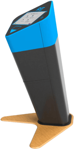
As the Quality Assurance (QA) since the end of 2018, I had the opportunity to closely monitor user feedback and complaints related to the previous generation of kiosks. This experience provided me with valuable insights into the areas that needed improvement and helped shape the development of the new generation kiosk.
The design
To address the identified needs and enhance the user experience, the following solutions were implemented:
Touch-Oriented Screen: The interface was designed to be fully touch-responsive, catering to the modern user's expectations for quick and intuitive interaction.
Progressive Layout: The layout was split into two sections, with one dedicated to providing a clear indication of progress. This new feature helps users understand their position in the process and manage their expectations.
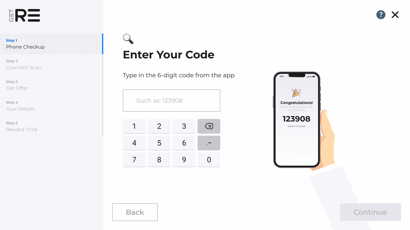
Animated Explanations: A combination of detailed explanations and animations was used to convey information in a visually appealing and easily digestible format. To keep users engaged while the system processes the price offer, a comprehensive animation was created that encapsulates the various background activities. This provides a visually appealing way to communicate the complexity of the process without overwhelming the user.
Simplified User Input: The reliance on complex user inputs was minimized, with technology taking the lead in providing necessary information. This streamlined approach ensures a smoother user experience and reduces the potential for errors.


Modular Design: The screens were designed in a Lego-style, allowing for easy customization and adaptation to meet the specific branding and functional requirements of different customers. This approach minimizes development time while maintaining a cohesive look and feel.
Color Palette
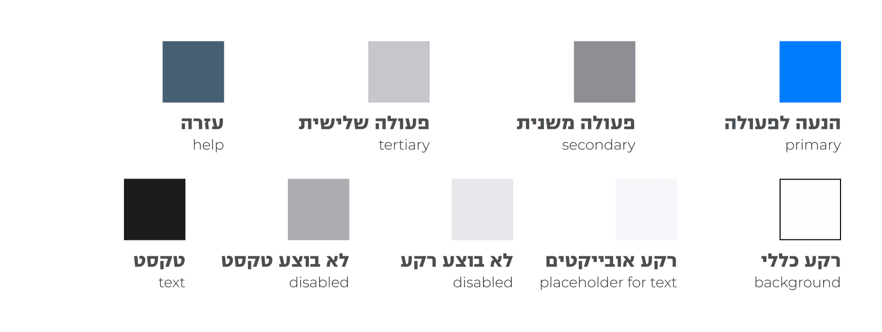
Typography